Natura
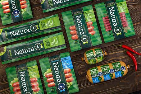
Logo development, packaging design and slogan creation for sausage products.
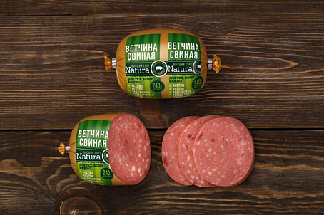
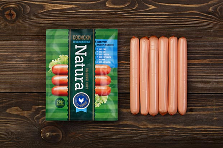
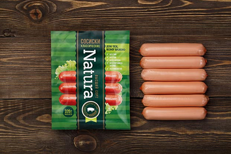
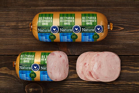
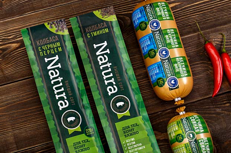
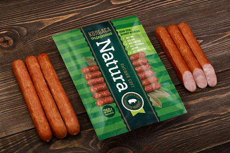
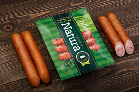
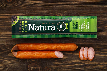
Green color, a brand color of the brand, conveys the idea of natural and organic nature while the heavy use of the color highlights the brand on the shelf and distinguishes it from the competitors. The USPs ("Unique Selling Point") were featured as markers, highlighting to the consumer the main advantages of the product and encouraging purchase.
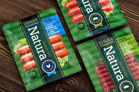
For the convenience of SKU differentiation, infographic icons were developed for each type of meat (chicken or pork). For the same reason, a color coding system for a type of product with USP was introduced, where green color was used for pork products and blue for chicken offerings.
The slogan "For those, who care" (in Russian) was placed on the packaging to appeal to the target audience: those who keep up with times, lead an active lifestyle and maintain healthy lifestyle.
