to.ma.to

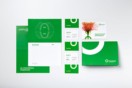
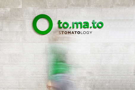
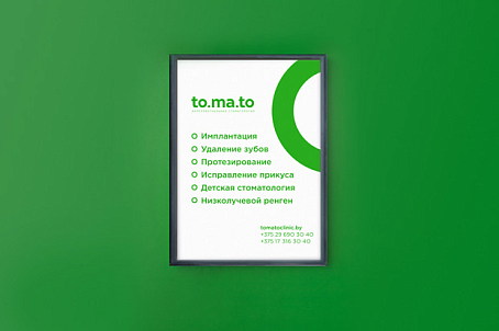
A laconic logo and a calm green color speak of expertise. Non-standard posters and communication messages contain a positive mood of the brand.
to.ma.to-image-26120
Brief
Fabula Branding has developed brand identity for TO.MA.TO – a private dental clinic. Its values include high professionalism, innovative approaches, and personal treatment of customers. The task was not only to demonstrate these qualities but to create a friendly and humane brand image contrary to the widespread association of dental clinics with something harsh and frightening. This was the stereotype we had to fight.
to.ma.to-image-26138
to.ma.to-image-26139
to.ma.to-image-26140
Decision

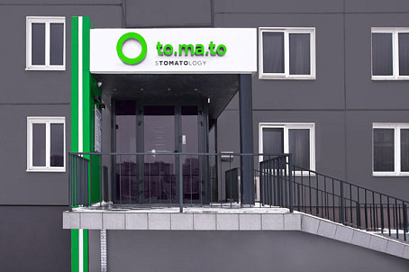
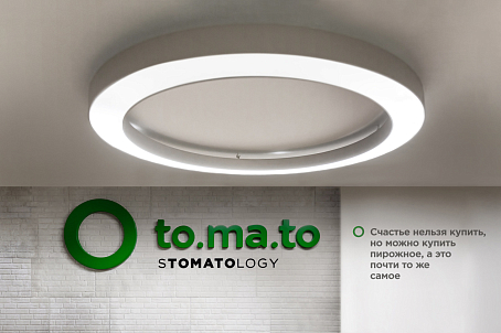
Have a closer look at the word sTOMATOlogy, and you’ll see a friendly name TO.MA.TO that is also quite new for the industry. This name is positive, rhythmic, and bright, and it helps distinguish the brand from competitors that stick to conservative naming approaches.

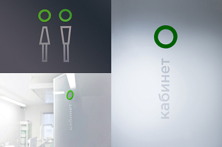
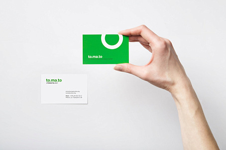
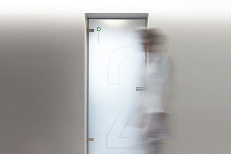
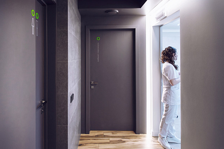
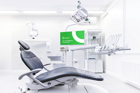
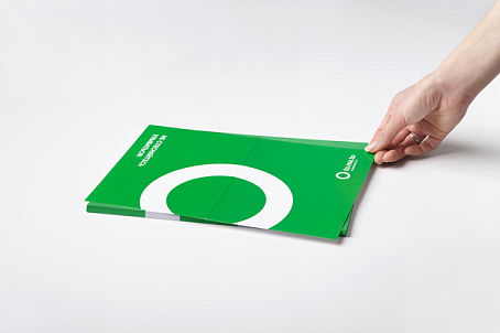
The visual components of the brand identity indicate expertise and professionalism that are of extreme importance in medicine. A laconic logo, clear geometrical lines, and calm green colour are intended to solve this task. Basic elements can be easily integrated in interior design solutions and adapted for various informational media.

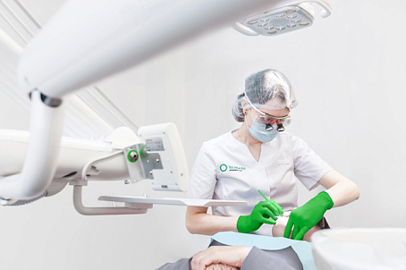
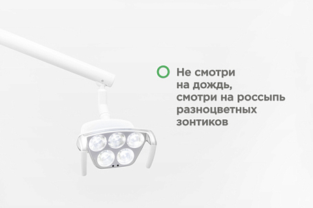
The overall mood is created by interior communication solutions: unusual “X-ray” posters support the general medical topic but present it in a different way. Personal messages on various media add to the sincere and friendly feel of the brand.


to.ma.to-image-26127
to.ma.to-image-26128
to.ma.to-image-26129
to.ma.to-image-26130
to.ma.to-image-26131
to.ma.to-image-26132
to.ma.to-image-26133
to.ma.to-image-26134
to.ma.to-image-26135
to.ma.to-image-26136
to.ma.to-image-26137
Let's talk about the strengths and weaknesses of your brand
×
Let's talk about the strengths and weaknesses of your brand
Leave a contact and we'll get back to you within a day